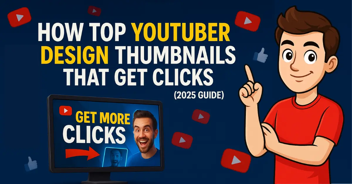
Your thumbnail is your first impression. They are decision triggers. A thumbnail often decides whether someone pauses to watch or just keeps scrolling. YouTube has shared that videos with higher click-through rates (CTR) are more likely to appear in search results and recommendations — because people are clearly showing interest.
Most of the time, people decide to watch your video just by looking at the thumbnail. If it doesn’t grab their attention, they’ll just scroll past. That’s why good creators don’t just make their thumbnails look nice — they make sure they grab attention and make people want to click.
In this article, you’ll learn how top YouTubers create high-performing thumbnails using practical design strategies, emotional psychology, and smart visual hooks.
Why YouTube Thumbnails Matter More Than Titles
A strong thumbnail can often make the difference between getting views — or getting ignored.
Titles vs Thumbnails: What Actually Gets Clicks
Even if your video title isn’t perfect, a thumbnail that catches the eye in the first few seconds can still help it reach more people.
YouTube has shared that when viewers pause and click quickly, it leads to better visibility, longer watch time, and a higher chance of your video getting recommended.
What Makes a Thumbnail Truly Click-Worthy?
There’s no single formula that works for everyone. But most successful thumbnails have a few things in common — they connect emotionally, they’re easy to read, and they make the viewer curious enough to click.
Most feature a zoomed-in face, eye contact, and strong emotion (shock, joy, confusion).
They avoid clutter and instead highlight one idea that creates curiosity — not confusion.
Good thumbnails also follow visual rules:
- Use high contrast colors
- Keep text short and bold
- Leave whitespace around key objects
- Avoid too many elements competing for attention
These small visual details — like color contrast, facial expression, or bold text — help grab the viewer’s attention. They make people pause for a moment, feel an emotion, and feel curious enough to click on the video.
Which Tools Do Top Creators Use to Design Their Thumbnails?
Creators don’t all use the same tool — they use what matches their workflow.
Many beginners use Canva for speed and ease. Designers prefer Photoshop or Figma for customization. Mobile creators rely on apps like PixelLab for thumbnails on the go.
For example, a vlogger may use Photoshop for precision and expression editing, while a tutorial creator might prefer Canva’s templates to save time.
There’s no fixed rule here. The best tool is the one that:
- Matches your skill level
- Fits your publishing speed
- Helps you create consistently clickable visuals
Thumbnail Strategy Top YouTubers Quietly Follow
Behind every viral video is often a thumbnail that’s been tested, compared, and replaced.
Top creators don’t guess — they experiment. They preview thumbnails in YouTube Studio, track their CTR, and re-upload better versions if needed. It’s a process of constant experimentation and refinement, not guesswork.
They ask:
- Is this face expressive enough?
- Does this create curiosity?
- Does it match the title tone?
The goal is alignment — title + thumbnail must tell the same emotional story.
Design Tips from Experts Who Work Behind the Scenes
Designers who work behind the scenes for top YouTubers don’t rely on flashy effects or over-the-top visuals. Instead, they follow proven psychological design principles and focus on creating thumbnails that are easy to understand Their goal is clarity, emotion, and immediate impact — not complexity. They recommend:
- Use clear outlines around faces and text
- Stick to a single subject (not 5 competing visuals)
- Test contrast by previewing thumbnails in grayscale
- Avoid trending gimmicks unless they fit your brand
Expert Designers Always Think Mobile First
And finally — they always preview thumbnails on mobile screen size before publishing, because over 70% of YouTube traffic comes from mobile users. If your thumbnail doesn’t work on a small screen, it won’t work at all.
Mistakes That Can Kill Your Thumbnail Performance
Sometimes, even well-known YouTubers make small thumbnail mistakes without meaning to. These small issues might not seem like a big deal at first, but they can quietly reduce your video’s reach — simply because fewer people feel interested enough to click. These issues may look small, but they can kill your CTR, reduce impressions, and hurt how YouTube recommends your content.
The most common mistakes:
- Using generic stock images that lack personality or uniqueness
- Adding too much text — more than 5–6 words becomes cluttered, especially on mobile
- Flat background colors with no depth or contrast to make elements stand out
- Mismatched visuals that don’t represent the actual topic or promise of the video
When your thumbnail looks confusing, irrelevant, or boring — people scroll past it. And YouTube takes that as a signal to stop pushing your video.
To succeed, your thumbnail must feel honest, emotionally engaging, and visually focused on one clear message.
How to Study Top YouTube Thumbnails Without Copying Them
One of the easiest ways to study top-performing thumbnails is to collect them and observe their design patterns over time. Instead of manually taking screenshots, you can use a free tool such as getytthumb.com.
This tool helps you download YouTube video thumbnails in HD quality — with no login required and absolutely free to use. It’s a time-saving solution for creators who want to analyze and compare thumbnails from different channels quickly, without installing software or cropping images by hand.
Note: The purpose of downloading these thumbnails is purely educational and inspirational. You should never reuse or copy someone else’s thumbnail. Instead, use them to understand visual trends, layout styles, and to sharpen your own creative direction as a YouTuber.
Final Thought: The Real Goal Is to Build Trust — Not Just Earn Clicks
A nice-looking thumbnail might get attention, but the ones that feel real and match the video’s message are the ones people actually click.
Think about what your audience feels when they see your thumbnail. Does it make them wonder? Does it feel real? Does it match the video’s promise?
If your thumbnail creates trust before the video even starts, you’ve already won half the battle. It’s not just an image — it’s your first impression. And when that impression is clear, powerful, and emotionally tuned in, people don’t just click — they stay.